Dos and Dont's
Do Use RGB Gray and Not Transparency
Posted by Laser Tech on
One major misstep in file setup includes adding a transparency to lighten RGB black (0,0,0) to RGB gray (128,128,128) or (230,230,230) or RGB white (#FFFFF). This will not result in lighter etching. The laser does not recognize transparency. The laser will etch RGB black no matter what grade of transparency you use. Don't use a transparency to lighten RGB black!Instead, setup a color palette in your vector editor. This will save you time!Follow the link to our color palette setup post to get started.
Do Set Up a RGB Color Palette
Posted by Laser Tech on
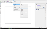
We highly recommend setting up your color palette before you get started designing. You can create a custom RGB color palette in your vector editing program.
- Tags: color palette, DIY
Do Make Your Pieces Larger Than 1/4" x 1/4"
Posted by Laser Tech on
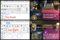
A good rule of thumb for laser cutting is to make sure that your pieces are larger than 1/4" x 1/4" to ensure that they cleanly cut out, don't burn up and fall through the honeycomb sheet that sits on top of the laser table. Below is an example of the scale of design that is too small to cut out and what will happen if your pieces are 1/4" x 1/4" and smaller. BUT what if I have a piece that is 1/4" x 1/4" or smaller? Many customers design signage with cut out text for dimension or small...
Do - Submit a .PDF with Editable Vectors
Posted by Laser Tech on
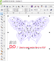
Make sure to save your vector designs as a .PDF in your graphic software. DO: After you finish designing your vectors in your program such as Adobe Illustrator, CorelDraw or InkScape, save the file as a PDF. This is an important step, because this file type will save all your vector data no matter what vector software you use. You will noticed that every node of the design is selected, which means that this is an editable vector and not an image imported in to the file. DON'T: Drop a JPG or BMP or any non-vector image into a...
- Tags: jpg, vector, vector graphics
DO: Use an accepted vector graphics program
Posted by Amanda Dimova on
EVEN if your file passes the checker, it MIGHT NOT be read correctly by our machine. Due to the ways different programs process PDF files, the only programs that work with our machines are the following: -CorelDRAW -Adobe Illustrator -InkScape (FREE at Inkscape.org) If you create a PDF with either of these programs and make sure to retain RGB formatting, the file will likely be read correctly by our equipment. There is always possibility of some error as different operating systems work differently. PDFs created with programs such as AutoCAD or other proprietary software do not always translate well into...
DO Make sure your file is under 1MB
Posted by Laser Tech on
Our machines can only handle so much data. The max we can send at a time is 1MB of data. More than that and they struggle to process the data, causing glitches and no output. Therefore we cap file size at 1MB and reserve the right to cancel orders that do not meet this criteria. In order to combat the issue of file size here are a couple of solutions: 1. Tile less on your page 2. Reduce the detail of your designs. -This can be either by taking out whole elements, spacing detail further apart, or simply reducing the nodes on a...
DO Keep a .2" Margin from your page edge
Posted by Laser Tech on
A common mistake is placing designs all the way to the edge of the art board. This can result in pieces close to the edge getting cut off. Make sure you keep a .2" margin from your page edge. In the sample above, the designer created guidelines that are .2" from the page edge. This layout is 12"x6". Almost all edges of all parts are sticking out of the safe zone and will most certainly get cut off, resulting in unusable pieces. No one wants that! If your project sticks out, we usually cancel the order right away and...
- Tags: border, cut off, margin, margin of error
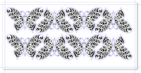
DO- Use Black and Gray Fills for Area Etch
Posted by Laser Tech on
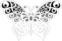
Laser etching fills can ONLY be done in black, medium gray, or light gray. Colors are for lines only! Don't use green, red, or magenta for filling shapes The blue hairline is OK, but the fills won't process at all. Your order will be returned for revisions. The laser cutter will not recognize any of those fill lines and the project will not process. Do use Black, Medium Gray, or Light Gray for etching areas Here we have the Outfab butterfly with a blue outline for cutting, black for heavy etching, medium gray for medium etching, and...
Do - Center Projects in a Frame
Posted by Laser Tech on

Waldo wanted to make custom laser signs about 12"x24" in wood for his dorm room. He opened his file in CorelDRAW, set the page to the units he wanted. Then he wrote the text and centered it in the page. But when it came in the mail, it looked all wrong! What happened? Don't use your page as a frame Waldo made the mistake that many first time laser cut sign makers make. He used his page as a frame. If there are no blue cut lines to signify the border, just the text alone is sent to the...
Do - Bulk Up Delicate Parts
Posted by Laser Tech on

Nancy wanted to make a sign for her room, so she downloaded inkscape and got to work! But she didn't see the part about making parts thicker than .125" so her project disintegrated in her hands. Don't make parts thinner than .125" You can measure thickness in your editor by drawing a small rectangle and placing it over the parts you think are too thin. Sooooo thin and fragile! Even if cut in steel it will easily bend out of shape. It's so thin, light shines through it. Do bulk up delicate parts By adding a contour around...
DO - Use Only Lines to Designate Shapes
Posted by Laser Tech on

Imagine you're making a pattern to custom laser cut your own parts. Oh wait, you are! Well then, draw the cutting line in blue on your vector graphics editor. What's that you say? You want it in black acrylic? And want to represent that using a black fill? Ooops! You don't need to fill areas if you just want a simple cutout. Blue lines are cutting lines, but black fill will result in... Completely etched surface due to the black fill. The perfect gloss of the acrylic is lost. DO use blue hairlines There we go!...
Do- Thicken Black & Gray Lines
Posted by Laser Tech on

Bold lines can be achieved by using lines .4pt or thicker and black, medium gray, or light gray. In some cases, designers want the line decoration to be bold and prefer not to use the magenta, green, red, or hairline etch. Don't use black and gray hairlines Here the blue outline is correct, but the black and gray lines are too thin. They will cause the file checker to reject the file and require revisions. Since the file will be rejected for revisions, nothing will get cut out. The laser cutter wouldn't recognize the objects anyway. Do Use...
DO - Use Green, Red or Magenta Line Etch
Posted by Laser Tech on

The blue outline is set up correctly, but the laser will not recognize black, gray, or light gray lines under .3PT. This will cause the file checker to reject your file for revisions. Your file will not process. Use ONE outline color per design. Use the RGB settings in the guidelines and .25pt line thickness. Colors only represent the line path, they will not actually laser cut in that color. Laser line etch results on birch wood. Though this example shows all the line colors, it is really only necessary to use one color. Even the most...
DO - Flip Your Design When Ordering Mirror Acrylic
Posted by Laser Tech on

Mirror is cut face down through the reflective backing so that the etched areas will let light through. There is paper or plastic mask on the mirrored "good" side. Mirror is cut face down whether or not there is etching! Files are cut exactly as they are sent. Remember to flip your file backwards when ordering mirror acrylic. Flip your design in your file. Text will etch backwards on the back of the acrylic. When you remove the masking from the front of mirror acrylic, text will be legible and oriented the right way as pictured above. Text...
DO- Use Line Etch OR Fill but not both!
Posted by Laser Tech on

Jaime is designing some laser cut wood charms and pins for her online store. She ordered a sample cut of her charms to test out her designs. She decides to use a red line etch on top of a black fill thinking that this will accentuate the depth of the design. This resulted in the red line etch slightly misaligned with the black fill. This is not the effect Jaime was going for. Don't use line etch around a fill Can you see the red outline around the black fill? It looks perfectly matched up in the graphic, but...
DO- Add a Cut Border
Posted by Laser Tech on

Josh submitted his design file for custom laser cutting with multiple designs in a single unit, but one design is missing a RGB blue cut line that will cutout the charm. Whoops! Don't forget the cut lines! A smiley with all black 1.5PT lines will only etch a smiley, but there are no blue cut lines. Therefore... Nothing will cut out. Surrounding pieces with proper blue cut lines made it, but this smiley face without the blue line did not cut out. DO USE CUT LINES AROUND YOUR PIECES The RGB blue line represents the cut outs, but Josh decided...
DO- Check All Blue Lines
Posted by Laser Tech on

Ginger is new to designing vectors for laser cutting. She was sure that if you put one shape on top of the other that both shapes would cut out without being cut off. Nope. Ginger failed to realize that the laser sees all blue cut lines even the cutlines that are covered with white fill. Good thing she ordered a sample before she placed her order. Don't Cover Up Lines! Ginger's original file looks OK to the eye, but will actually cut through the bolt completely. It results in the heart line cutting out completely through the bolt, resulting in an...
DO- Scale Your Projects
Posted by Laser Tech on

Richard submitted his vector design for laser cutting, but he did not scale his design to his desired proportions. He instead typed the size to the right of his vector design. Don't list dimensions The actual size of this graphic is circled in red on your design program. The size here reads .912x.867, therefore, the actual cut out is that size, regardless of what the note reads. It doesn't matter how big it looks on the screen, only the dimensions you set in the file. Here you can see the cut out next to a measuring tape. It is...
DO- Leave .125" Between Parts
Posted by Laser Tech on

Sarah just adopted both a dog and cat from the animal shelter and wants to make a tags for her new pets. She just received some sample cuts of her dog tag designs in the mail, but the hole where the jump rings were supposed to attach was broken. DON'T put parts too close together The hole is too close to the edge and will result in.. The hole completely melting away! Now these charms are useless. DO leave .125" between parts Parts should have enough space between so they do not melt back together or disintegrate...
DO - Break apart your text
Posted by Outfab Team on

Arthur just finished a one of a kind special nameplate necklace for his girlfriend Tamara, but when the finished parts came in the mail, the text was all wrong! Off center and not even the right font! Don't Leave Text Intact Outfab doesn't have every font. It is up to the designer to make sure the font is converted from editable text to fixed shapes. This image shows a real life cut out in blue acrylic based on the graphic above with proper "text broken apart" Do Break apart your text If we don't have the font, it...