Vectorize Real Drawings (Inkscape Version)
Posted by Laser Tech on
Did you know you can take any drawing and convert it into a vector graphic?
You don't need expensive software, you can download InkScape which is free!
I've designed the instructable to walk you through the most efficient manner to make the best laser etch possible. Most people do not realize the importance of contouring to make something stronger, adding a loop, or using pure black & white graphics for etching (as opposed to grayscale).
Use any old camera to take a photo of the artwork. I hate plugging the scanner in and importing scanned photos when I can just email or dropbox myself a photo from my phone just as well. Just make sure the contrast is pretty good. This one was taken with a cell phone camera.
The more contrast in the artwork, the better. This drawing was done by a 5 year old with dark marker on a white sheet of paper so it looks really good.
1. After you import the photo, select "autotrace bitmap" it's under the "PATH" tab.
2. In the "trace bitmap" options, tweak the settings until you get where you can see the amount of detail you want. Every drawing will have different thresholds. You will want to do 2 colors (for black and white) Make sure you have "brightness cut off" selected.
3. Next you can see the auto-traced shape on top of your original drawing. You can now delete the original drawing from your inkscape file.
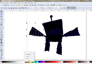
4. Now you need to "break apart" the design (also in the "PATH" menu) in order to delete all those funny black shapes around the sides and to further tweak your design to make it pretty and tidy. However, you need to know that when you "break apart" groups of shapes, sometimes they revert to solid color. You can see by the dotted lines that those shapes are still there, they're just stacked up black shapes so it looks like a black blob. You can slowly pick out those shapes that should be white and change their fill to white.
here it looks all black...so to see what I'm doing I selected the whole design and added a blue outline.
when you drag over and select you can see the shapes lurking
And by filling with white it now looks as it should.
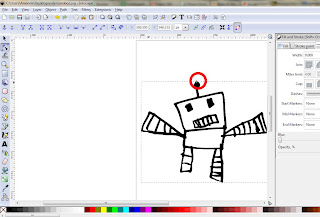
This is a trick to reducing the nodes. Sometimes during auto-trace, it really goes into overkill on the detail. A simple rectangle like this doesn't need so many nodes. Nodes are the points on a line that define said line. Each additional node adds data to the file, making it bigger. It also makes the final product appear more "scruffy" and jagged.
Select a shape and use the black "node arrow" to select all the nodes. Then go to "PATH" and "Simplify"
There, now isn't that better? Repeat on all shapes you feel might be too "nodey"
Now I want to make a contour around this shape because where the arms touch is pretty small and can be fragile. Go to "PATH" >Linked offset.
Then you choose your offset starting point and drag the mouse away to adjust the offset.
Once you're finished, convert the offset to path via the path menu, change the outline to blue hairline outline and the fill to X.
Finally, resize your design to your desired final dimensions, double check that all the lines are the right size and color and that the fills are the right color.
The final touch on this design is two holes on either hand of the robot to make a floater charm for a necklace.
If you want to cut your design out many times, you should group it as one design and copy and paste it to fit on your material of choice.
This final design was cut into two-layer white on black acrylic. It was a perfect Mother's Day gift! You can even add in another charm that has details on the drawing, such as age, date, name, etc.


